What landed
The list did not sound like ordinary nutrition advice. It sounded unusually precise, personalized, and almost clinical. Specific enough to save. Authoritative enough to forward.
If you scrolled past without pausing, you would probably walk away with something like this: healthy foods are not universally healthy; specific foods have specific contraindications; if you have one of the listed conditions, you should know which staples to avoid.
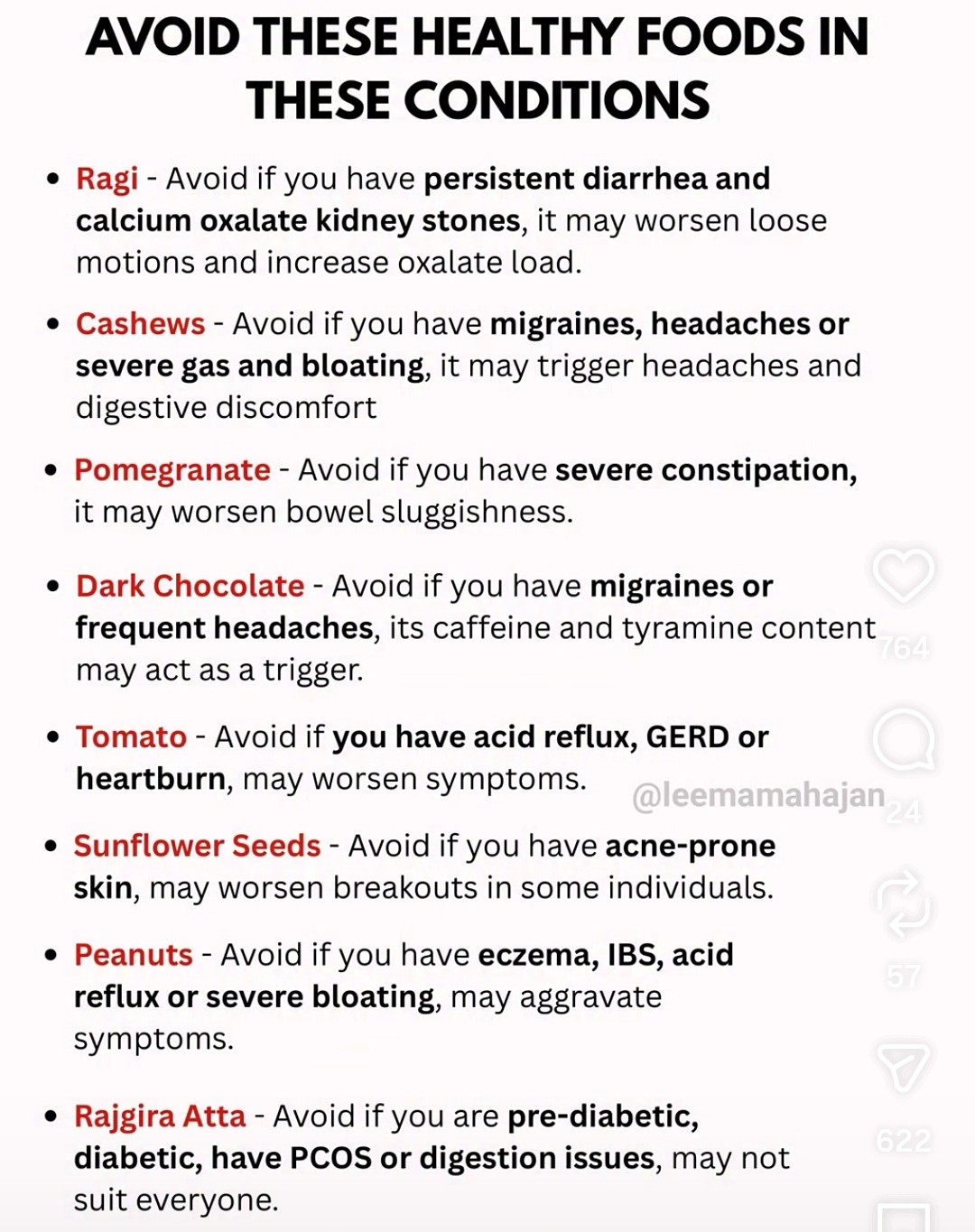
Look at the list again. Tomatoes and reflux. Chocolate and migraines. Ragi and oxalate. Each row has a food in red, a condition in bold, a mechanism in plain language, and an implied action. The title frames the foods as healthy, which makes the contraindications feel counterintuitive and therefore careful.
That is a reasonable takeaway. It is also the feeling this article is trying to understand. Not whether row four is correct. Why the whole list feels like something a clinician might have written.
What caught my attention
I did not pause because the graphic sounded absurd. I paused because it sounded specific.
We live in an era when nutrition is supposed to be personal. Celiac disease, food allergy, kidney disease, and structured low-FODMAP protocols all involve real dietary individualization.123
Research on personalized glycemic response has shown that identical meals can produce meaningfully different post-meal glucose trajectories across individuals.4 The graphic speaks in that register: if you have this condition, avoid this food, because of this mechanism.
My first instinct was to treat it like a fact-check. Open a few rows. See which pairings hold up. That is a reasonable instinct. It is also the wrong front door.
The question that opened up for me was different: how do we distinguish genuine personalization from the appearance of personalization?
The grammar of the graphic
Scroll back to the claim card above if you need the list in view. Every row follows the same syntax: food + condition + mechanism + implied action.
Ragi. Kidney stones. Oxalate load. Avoid. Dark chocolate. Migraines. Caffeine and tyramine. Avoid. Pomegranate. Constipation. Worsens sluggishness. Avoid.
This is the visual grammar of clinical contraindication compressed into a scroll-stopping list. Food in red signals exception. The condition names you. The mechanism explains why the pairing is not arbitrary. The title tells you these are healthy foods, which positions the author as someone complicating the wellness story rather than repeating it.
The format does not ask you to evaluate eight separate claims. It asks you to trust one way of knowing. That is why this image works as a case study. The foods and conditions change across posts like this. The grammar stays the same.
Once I could name that grammar, I wanted to know whether every row matched it in the same way.
What happens when you open a row
I did open a few rows. Not to score the whole list. To see whether the evidence behind different pairings looked the same once you left the graphic.
It did not. That mismatch is the discovery.
1Clinical tradition Tomato and acid reflux
Tomato and reflux is the row that sounds most like clinic language. Acidic foods are commonly discussed as symptom triggers in GERD counseling. Guidelines and patient materials often include tomato-based foods among foods to notice if heartburn worsens.5 The mechanism is plausible. The clinical conversation is familiar.
But even here, the row is doing more work than clinic language usually does. Trigger lists in reflux are inconsistent across patients. Some people tolerate cooked tomato better than raw. Some tolerate small amounts. The advice at this layer is usually conditional: if this worsens your symptoms, reduce or avoid it for now, then reassess. The graphic gives you a stable pairing.
2Individual variation Dark chocolate and migraine
Chocolate and migraine points in a different direction. Caffeine and tyramine-related compounds really do appear in headache trigger discussions.6 Some patients identify chocolate as a consistent trigger. Others do not. Provocation studies have produced mixed results, which is exactly what you would expect if the relationship is real but highly individual.7
On the graphic, tomato and chocolate occupy the same row shape. In the literature, one looks more like a common clinical pattern across a subset of patients. The other looks more like a hypothesis worth testing in a specific person. The format cannot show that difference without breaking its own uniformity.
3Thin evidence Pomegranate and constipation
Pomegranate and constipation is where the case study sharpened for me. I had trouble locating the pairing the graphic implies. Pomegranate is often discussed for digestive effects, but many public-facing recommendations use it in the context of relieving constipation rather than worsening it, largely because the arils contain fiber.8 There may be traditional or preparation-specific reasoning behind the row. The one-line caption cannot hold that complexity.
What matters is that this row does not appear to rest on the same kind of support as tomato and reflux, yet it wears the same font, the same sentence shape, and the same implied certainty. That was when I stopped treating the list as a collection of food questions and started treating it as a format question.
Uniform certainty
Go back to the graphic one more time. Eight rows. Same visual weight. Same rhetorical packaging. Same implied conclusion.
This is the strongest thing the image does. It creates an impression of uniform certainty that the underlying evidence does not warrant.
The list does not distinguish strong rows from weak rows because distinguishing them would weaken the product. A format built for saves and shares needs every row to look equally settled. The reader is not meant to ask which pairings earned their confidence. The reader is meant to feel that the whole table is the kind of thing a careful professional might keep on file.
That feeling is the phenomenon.
What genuine personalization requires
The graphic sits inside a real tension. Precision nutrition is not a marketing invention. Absolute contraindications exist where the biology is not negotiable. Structured protocols exist with defined populations and follow-up.123 Emerging work on individual glycemic response and microbiome variation is still early and uneven, but it begins from measurement, not from a lookup table.4
What those examples share is not merely specificity. They share a loop:
- Who is this for?
- Under what criteria?
- At what dose? Prepared how?
- With what result?
- Should the recommendation change if the result is not what we expected?
- Can it be revised, narrowed, or reversed?
Genuine personalization is food plus condition plus mechanism plus feedback. The graphic gives you the contraindication without the trial. It ends where the experiment would begin.
How to tell the difference
So how do you read a list like this in practice?
Not by dismissing it automatically. Several rows may point toward real questions worth asking. A person with reflux, migraine, or kidney stones may genuinely benefit from noticing whether a food worsens symptoms. The better question is whether the advice behaves like personalization or only looks like it.
Look back at the graphic and ask three things. Does it name a subgroup, or only a label? Does it include a test (remove, observe, reintroduce, adjust portion)? If every row wears identical confidence, is that evidence about the foods, or about the format?
Those questions are portable. They apply beyond this post. They are also the reason the image remains the anchor. You are not only asking whether a row is true. You are asking what kind of knowing it is pretending to be.
What remains unresolved
Tracing the format does not settle whether pomegranate belongs on a constipation list. It leaves a different problem visible: advice that borrows the language and visual grammar of precision medicine without the testing, feedback, and refinement that make precision medicine work.
Some of the biology behind the rows is real. Some of the pairings may help the right person ask the right question. What the image taught me is that those possibilities can coexist with a presentation more certain than the evidence behind it.
The graphic is the case study. The case study is not tomatoes or chocolate or rajgira. It is what happens when advice starts looking precise before it has done the work precision requires.